Why the Logo is the Foundation of Every Brand
A logo is often seen as a visual detail: a symbol, a graphic, a design element. But in reality, it is one of the most powerful foundations of your brand’s identity. It is the first point of contact between your brand and your audience, the first impression, the first emotional signal, and often the first element people remember.
Before your brand tells its story, explains your values, presents your services, or builds a relationship with your audience, it is seen. And in that first moment of visual contact, something happens instantly: perception is created. Trust, credibility, positioning, and emotional connection begin forming before a single word is read.
This is why your logo is not decoration. It is not an accessory. It is not simply an aesthetic choice.
It is a strategic tool.
A well-designed logo carries meaning. It expresses identity, reflects values, supports positioning, and creates recognition. It becomes the visual anchor that holds the entire brand ecosystem together, from website to social media, from content to events, from communication to reputation. Everything connects back to it.
At Klopfel Media, we don’t create logos to make something “look nice.” We design visual identities with intention, coherence, and long-term vision. Our approach goes beyond aesthetics and trends. We work on structure, symbolism, alignment, and brand consistency, because your logo should represent YOU. This is also why for this type of project, we want to get to know you. Not just your brief, not just guidelines: we want to know who you are, what you do, where your heart lies, so that we can create something that resembles you, and only you.
We also believe that a logo should not follow trends. Trends don't last, your logo will. A good logo is one that lasts in time, where you look back at it in 20 years and still think it fits perfectly with the brand you've built.
If you are building a brand, a company, or a project, your logo is not where you start “designing.”
It’s where you start positioning.
And that’s exactly how we approach it.
Let us show you a few examples of what we do!
Manon Massaguen Photography / Manon M. Wedding
Manon is a very talented photographer from South of France.
She has 2 brands : Manon M. Wedding, which is specialized in wedding events photography, and Manon Massaguen Photography, more focused on creative photography.
She wanted a minimalist logo for each of her brands, that still looks authentic, modern, that matches her energy, and that also links both brands.
After a little brainstorming, we came up with this idea: mixing 2 different fonts : one elegant, modern, easy to read, to highlight her name. And one more scripted, for the authenticity, that almost looks like a signature. And to add a little touch : little stars, since Manon is a very spiritual person and loves the astral aesthetic.
And here's the result! 2 modern logos, and an assorted compact version, that still shows emotions, humanity, authenticity, a little touch of magic, and most importantly: logos that resemble her.
Klopfel Media & 23D Studio
Klopfel Media has been created with the idea of "community"in mind. A company that works in the shadows to make their collaborators shine : this is the essence of our purpose, our value.
We want authentic, rough, raw. We want a communication centered around people, experience, and emotions. We don't want perfection, we don't want corporate things that fits into the same mold. We want to highlight the differences, the originality, the behind the scenes. For us, putting the focus on these unpolished aspects speaks much more than a perfectly crafted façade. It's REAL.
We wanted our logo to be this representation: neutral, in gray tones, to stay in the background, and imperfect, with uneven edges, for this perfectly imperfect effect (now try to say it 10 times and quickly, I think we just invented a tongue twister).
We applied the same logic to 23D Studio, the branch of Klopfel Media in charge of video production. First of all, to stay coherent with the main logo, but also because we have the same approach of the 23D Studio projects. Authentic, rough, raw. Human.
For this one, we also wanted to play with another concept, that is best highlighted with video: transparency. Which is why we settled on a "reversed" logo, with this plain colored shape, and the numbers in transparency, so that any design, image, video or color can become its background.
Those values being our core values (and we do not think it will change through the years), we are thinking of making it our signature design for the brand, as well as for its upcoming branches (yes, our project long time is to expand and diversify). We will stay human, raw, authentic and transparent, working in the shadows to make you shine.
Soul & Skin expert
Soul & Skin is a beauty salon located in Paris, and specialized in face and body skincare, with the use of special techniques such as laser hair removal, micro-needling, peelings and massages.
The creator of this brand, Sabrina, needed a total rebranding, more aligned with her. Her previous branding was "trendy" : O'Beauty, with a tropical plants aesthetic. Very nice at the beginning, but it didn't grow with her, instead it grew out of the trend, to a point she couldn't identify herself with it.
She wanted her logo to represent who she was : a woman with years of research and experience in beauty, who wants to heal other women's mind through their body, realigning them with themselves, so that their soul can be at peace with their body. She wanted something more rooted in this spiritual belief, and wanted a little reminder of her own roots too, without turning it into a clcihé of an oriental woman, she wanted something modern, highly symbolic while remaining visually subtle.
I took a trip to her salon and spent 3 days with her : observing her, discussing with her, about professional but also personnal topics, and I could understand her much better.
We came up with a whole new graphic identity : terracotta and sand colors, for the symbolic of a more grounded and rooted stance, mixed with natural textures such as ceramic, wood, sand and terrazzo materials. And the star of the show: the moon, represented as a sort of oriental rune that was very important in her family, a very meaningful token of her legacy, as well as the repesentation of feminity, and most importantly: reworked in a more modern way.
L'effet Mer by Analeans
Anaïs is a hairdresser from South of France. She is very talented, and passionate about tattoos aesthetics and alternative styles.
Her brand's name is a play on words with "Effet Mer" (sea effect) and "éphémère" (short-lived). Her hair salon is situated in a camping, on the French Riviera, hence it is close to the sea, and only opens during half the year. This is also why she wanted to have a sea inspired brand image.
Considering her love for alt-style, her love for tattoos, roses and skull, instead of a "boho sea style", we opted for a "pirate seas style".
And noticing that Ana is a gold girlie (full gold jewerly, including bracelets, rings, layered necklaces and multiple earrings and piercings)... We had to add it into the logo, to tie it all together and make it more like her.
Most logos nowadays are very minimalists, and all graphic designers prone that. Fair enough! However.... We are not totally agreeing. Sometimes, maximalism is the key, and a full artwork might not only represent your brand better, it will also catch the eye and stay in minds.
For this logo, we ended up creating an elegant "tattoo" inspired design of a skull and a rose, a pair of scissors to represent the "hairdresser" part, and a parchement, to link everything with a pirate vibe. And of course, the gold, echoing the gold of the pirate's treasure, and to match Ana's physical aesthetic.
We also worked with her on her brand design and opted for a glittery yet dark vibe, as if her brand was the treasure at the bottom of the sea, highlighting her logo, making it a rare and precious discovery and experience.
Lovely Family
We had the honor to assist Sihem in the creation of her own company of babysitting. With motherhood deeply rooted in her heart and in her veins, Sihem has been working as a nanny for decades. As a private nanny in France and the United States of America, as a Kids Club manager in a few different Resorts around the world, she decided to create her very own babysitting company, to be more aligned with her desire of traveling, instead of being trapped in a corporate structure that isn't compatible with her values.
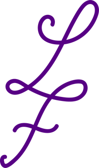
For her, being a nanny, is being part of a family. Every kids she's taken care of, she's treated as if they were her own, every family she worked with, she became a part of, and for her, being close to the kids is just as important as being close to the parents. She wanted at all cost the word "Family" to be highlighted.
She also wanted a symbolic color: purple, reflecting her calm and composed spirit, deep wisdom and creativity, as well as the colour representing her audience market : luxury.
We opted for a handwritten style, for more authenticity, with flowy and connected letters, made all in one go, as a "one line" type of graphic design, that can be used on its own as a compact logo, for an elegant an minimalist luxury logo.
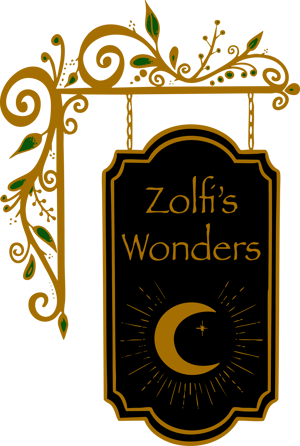
Zolfi's Wonders
As some of you might realize it... Hi. It's me. Zolfi. I am not just working with Klopfel Media... I opened my own company in September 2025, centered around handmade goods.
The idea behind this brand: a magic shop. I always loved the magical aesthetic, after growing up as a Harry Potter fan, I always dreamed of being a part of the Wizarding world, and having my own little shop in Diagon Alley. And I asked myself: why not have it now?
Technically, the internet is a sort of Diagon Alley, you can find everything on it. So let's make it magical, and realize my dream: I built my own little magic shop, filled with my handmade trinkets, infused with the most powerful magic: love. The only rule of my shop, is that every item has to be made with love.
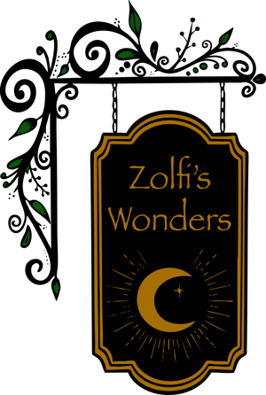
I then opted for a magical vibe / enchanted forest aesthetic, with a vintage style for the logo. I wanted it to represent a sign that could be hung to a street wall in Hogsmeade.
Once again, forget about minimalism. I wanted this logo to resemble me, and I know that very few clients would order a maximalist logo. If not now, I would've never gotten the chance to create a logo like this one.